Fonts in iCab and Safari
Safari does a great job at rendering. It’s approximately as compatible with interactive sites as iCab. (Some work in one but not the other, and in both cases I occasionally have to use Internet Explorer.) I have some quibbles about the way it handles downloads and such, but it’s still beta and I think this stuff will all improve.
The area I’m concerned about is font rasterization. I don’t like fuzzy text, and Safari uses CoreGraphics, which is incapable of drawing nice crisp text. Some will say this is a feature, that the poor spacing is because it is more precisely following the font metrics. That’s taking WYSIWYG too far. The first job of a browsing application like Safari should be to make the content readable. If that means using a hand-tuned bitmap that is less true to the actual printed font, I’m all for it.
I am also well aware that many people like small anti-aliased text. Fine. I don’t want to take it away from you, and Apple wouldn’t listen to me anyway. However, I think Apple should let the user control the tradeoff between flavor and readability. This should be a system-level preference, and it should also be overridable at the application or font level.
Until Apple fixes this or the iCab folks improve their CSS support, I will be switching back and forth between iCab and Safari depending on the length and type of content, and on how much the page I’m reading uses CSS. (Developers: I would pay good money for a standards-compliant browser that uses QuickDraw.)
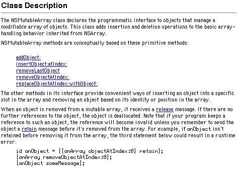
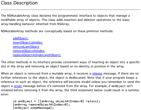
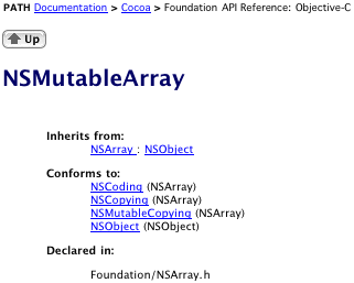
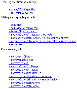
Here are some examples of how iCab and Safari render the documentation for NSMutableArray.
This is the class description in iCab. The body text is Geneva 10, the header is Helvetica, and the code is in ProFont. The text is crisp. It may not be beautiful, but I find it very easy to read. Note the way the descenders are drawn in the underlined text and how easy it is to see ProFont’s exaggerated punctuation.
This is the class description in Safari. The fonts are Geneva and ProFont. (Safari doesn’t provide an option for finer control, except through a custom stylesheet.) The bold text doesn’t appear bold because CoreGraphics doesn’t create synthetic styles. The descenders and the underlining are mashed together. The “anObject” in the code font stands out, jarringly so. The punctuation in the extended code example is muddy.
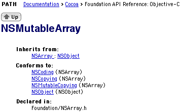
This is the top of the page in iCab. The header is anti-aliased with QuickDraw, and I think it looks nice. The indented headers appear very bold. My only complaint is that there’s a bit too much spacing after the opening parens.
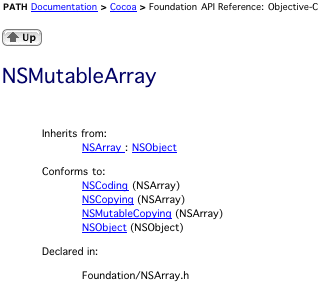
Here it is in Safari. Now it’s really obvious that Safari can’t do bold Geneva. The paren spacing is much better, though.
Here’s the same page using Safari’s default font, Lucida Grande. Now the bolds look nice. I’ll use Lucida Grande from now on, because it’s the font Apple uses to showcase CoreGraphics.
Here’s the method summary in iCab.
Here’s the method summary in Safari. Behold the smudges.
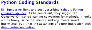
Now, here’s part of a post from my blog.
In Safari, you can’t even tell that the apostrophes are smart. The en-dash after the “C” looks shorter than the hyphen, and it’s really fuzzy. One thing I like about Safari’s rendering is that it doesn’t underline the space after “Python”; iCab does this, even though there’s a line break.
17 Comments RSS · Twitter
The Safari examples are so much, much better looking. I say this even though I, too, prefer smaller font sizes.
I simply cannot stand font smoothing and until this can be turned completely off in OS X and Safari, I'm staying in OS 9. This fuzzy type is a joke.
I'd suggest the following experiment: Launch Terminal, type 'pico' and paste some text into the terminal window. Then open Window Settings, choose Display from the PopUp menu and set the font to really small Monaco (4,5 or 6 pt.) Now turn anti-aliasing on and off, and check which version is more legible.
Greetings, iSee
Who uses 4 point monaco when they want something legible? That's the stupidest experiment ever. Go away.
I suddenly realise that Safari looks dire. It's because I've rarely compared it. I too want to be able to turn font smoothing OFF all over X. It's bugged me since the Public Beta and it STILL bugs me.
It makes you think you need glasses, when all you need is for the OS to get the hell out of the way.
Some folks have difficulty with AAing in fonts. Maybe due to our eyes. Astigmatisms may be the culprit. ??
It would be great if we the user had the option to make adjustments to our needs.
I've generally found the anti-aliasing in OSX to be kinder on my eyes when I'm trying to read pages and pages of things onscreen. The AAing combined with sans serif fonts makes what was once an eye-watering experience nearly painless (Y'all are complaining, but I'd hazard you've never tried to read postmodern theory in Netscape 4.7). The main problem, of course is coding and being able to see what each character is. Luckily, nobody codes in Safari, so to be totally honest I'm having a hard time figuring out what the problem is. Is it too hard to open (or copy-paste) this stuff into SimpleText?
Most folks over 40 can't read any of this small type and hate it. the partially sighted are completely excluded from most "designery" sites.
Most tiny fonted designery sites are next to invisible on modern monitors at high resoltutions.
Anti-aliasing looks great on any font not designed to not be anti-aliased. Anti-aliasing looks good on a bigger font.
The solution? Pick a bigger font.
Alex: Sharp screen fonts are useful for more than just coding. Besides the annoyance of copying and pasting everything just to read it, SimpleText is a Classic application and TextEdit draws text like Safari 1.0 beta 1.
Sambeau: Picking a bigger font would reduce my productivity because I'd have to scroll a lot more. However, I fully agree that so-called designery sites are annoying. Thankfully, Safari and iCab both let you set the minimum font size you like, so the type never gets too small.
Lots of people continue to complain about fuzzy type in OS X, and to them I say: You are sitting too close to the screen, and trying to read type that is too small! Stop looking at the pixels and look at the IMAGE. If you can't see enough text at a reasonable size (on today's monitors averaging 85 dpi, I recommend 11~14 point for the web), then you need a bigger screen.
On the other hand, Quartz-rendered text does seem optimized for display on the incredibly sharp FPDs. On CRT screens, which are themselves fuzzy, the old bitmap fonts look better for tiny sizes.
Going from CRT to FPD is a big adjustment, which I did in mid-System, when my old multi-scan monitor died. Now on the FPD, I find OS 9 very hard-edged, and the softness of OS X is a relief.
MJ: Why should I have to get a bigger screen to see the same amount of text that I used to be able to see? What if a bigger screen isn't an option due to cost, size, portability, etc.?
is just read a bit on your site about anti-aliasing on x and the disadvantages.
i fully agree and would like to see real os-builtin bitmap-font support, instead of those pixel-blur. it hurts my eyes, mostly every pro-user will agree, that small aa fonts are visually annoying. what second most annoying is the weird mix of aa-fonts and bitmaps in many x-apps, which CAN be done, but mostly it is done without a plain idea of a the *look and feel* ...
but it's apple: they stick to their program. so they will kill bitmapfonts if the users won't shout out loud.
what is really strange: many many flash-websites moved toward crisp bitmapfonts again, after gambled around for a while with standard outline-fonts. it's funny and a bit sad, that new OS (like x or xp) go the opposite way.
i just hope users will still be king instead of companies.
best,
andi
Newer monitors are shipping lower and lower pixel densities, in fact. Modern 19" LCDs have less resolution than my so-old-it's-beige 17" CRT.
Stop complaining about your vision and start using a browser that lets you resize fonts conveniently without breaking page layouts. Opera is pretty good for this.
Here's what I would do:
- not use old fonts not meant to be rendered with CoreGraphics (as you've described about Geneva vs Lucida Grande)
- don't use 9pt and expect it to be readable, AA or not.
- use subpixel-antialiasing
the first two are UI design guidelines that I think are pretty obvious; the last is a technological solution that helps in the case where people don't follow the first two guidelines.